
Running in Singapore leaves its mark. The heat, humidity, and the effort it takes to keep moving when the air feels heavy and the sun is already up.
These conditions shape every run, every training session, and every race day moment. Which is why, to us they aren’t obstacles to hide from. They’re part of who we are.
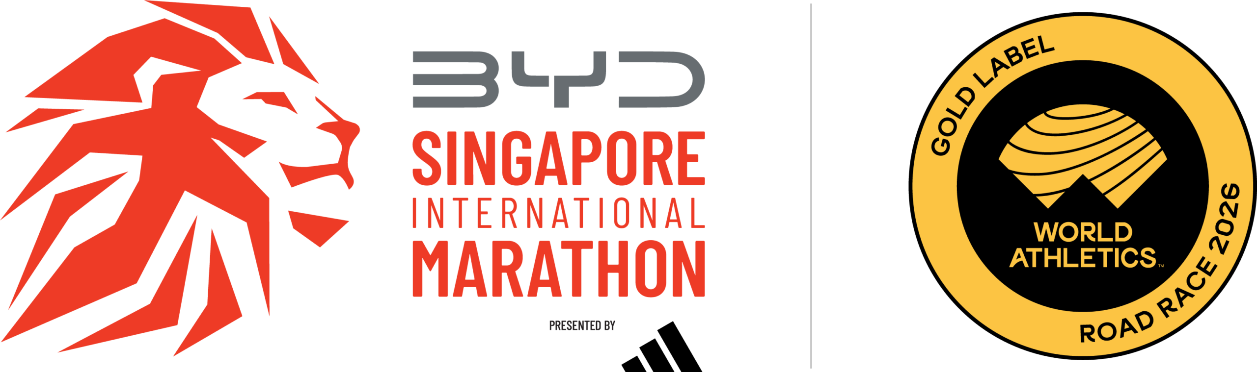
The refreshed visual identity of the BYD Singapore International Marathon presented by adidas is built from that truth.
A Mark Rooted in Courage and Movement
At the centre of the new identity is our new mark. A bold emblem inspired by the Merdeka Lions, a symbol tied to Singapore’s history and our sense of self.
The lion represents courage, strength, and excellence, qualities that define both the nation and the runners who take on its toughest race.
Look closer, and the mark reveals more. A runner’s form forms the centre of the lion’s mane, captured mid-stride. This detail speaks to motion, endurance, and progress. Reflecting not just our culture of running, but our unstoppable spirit in every aspect.
Designed to be strong and unmistakable, the mark holds its own across medals, bibs, apparel, city signage, and digital platforms. Recognisable at a distance. Meaningful up close. This is a symbol runners can wear with pride.

Dynamic Colours That Carry a New Energy
Every run through our city is an act of energy and defiance, shaped by heat, humidity, and grit. That spirit lives at the heart of our new colour palette, a vivid red that represents our Singaporean pride and strength, and a bright electric blue that represents our movement, and momentum.
Together, these colours are bold, dynamic, and unmistakable, designed to stand out across the city, from start lines and finish gantries to race bibs, medals, and supporter gear.
How Sweat Inspired our Design
Running is physical. It leaves traces. That’s why you’ll notice our design system that introduces a subtle pattern of dots inspired by sweat and fabric. The texture is intentionally understated, designed to reveal itself up close. Like sweat, it is earned through effort.
These dots reflect movement, exertion, and persistence. They echo the feel of a race tee after a long run, the quiet moments of fatigue and focus that define endurance sport.
The pattern adds depth and tactility to the system, grounding bold colours and strong typography in something human and real.
A System Built for the City
This refreshed identity is more than a logo or colour update. It is a complete design system built to live across the city and throughout marathon weekend.
From race communications and signage to medals, apparel, and digital platforms, the system is flexible and recognisable. It adapts to different distances, roles, and moments while remaining unmistakably Singapore International Marathon.
Most importantly, it is designed to be worn, shared, and claimed.
This is an identity runners, spectators and every participant can call their own. Proud, powerful, and unmistakably Singapore.